Daniel Stuhlpfarrer, Typefaces, Graphic design, Info + Contact, Trial Fonts, Fonts in use, Instagram, Behance, LinkedIn, Custom Font Generator, Composition Maker, Imprint, GDPR, EULA, FAQ
Back Graphic Design:
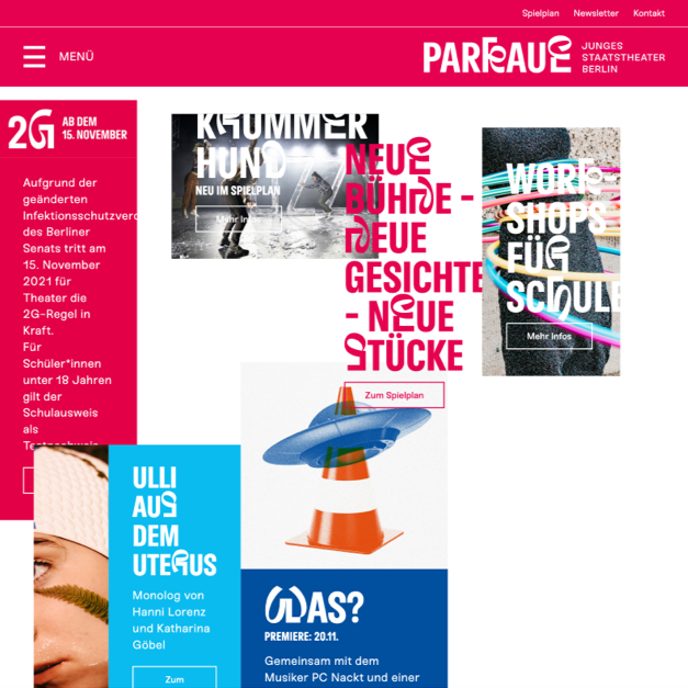
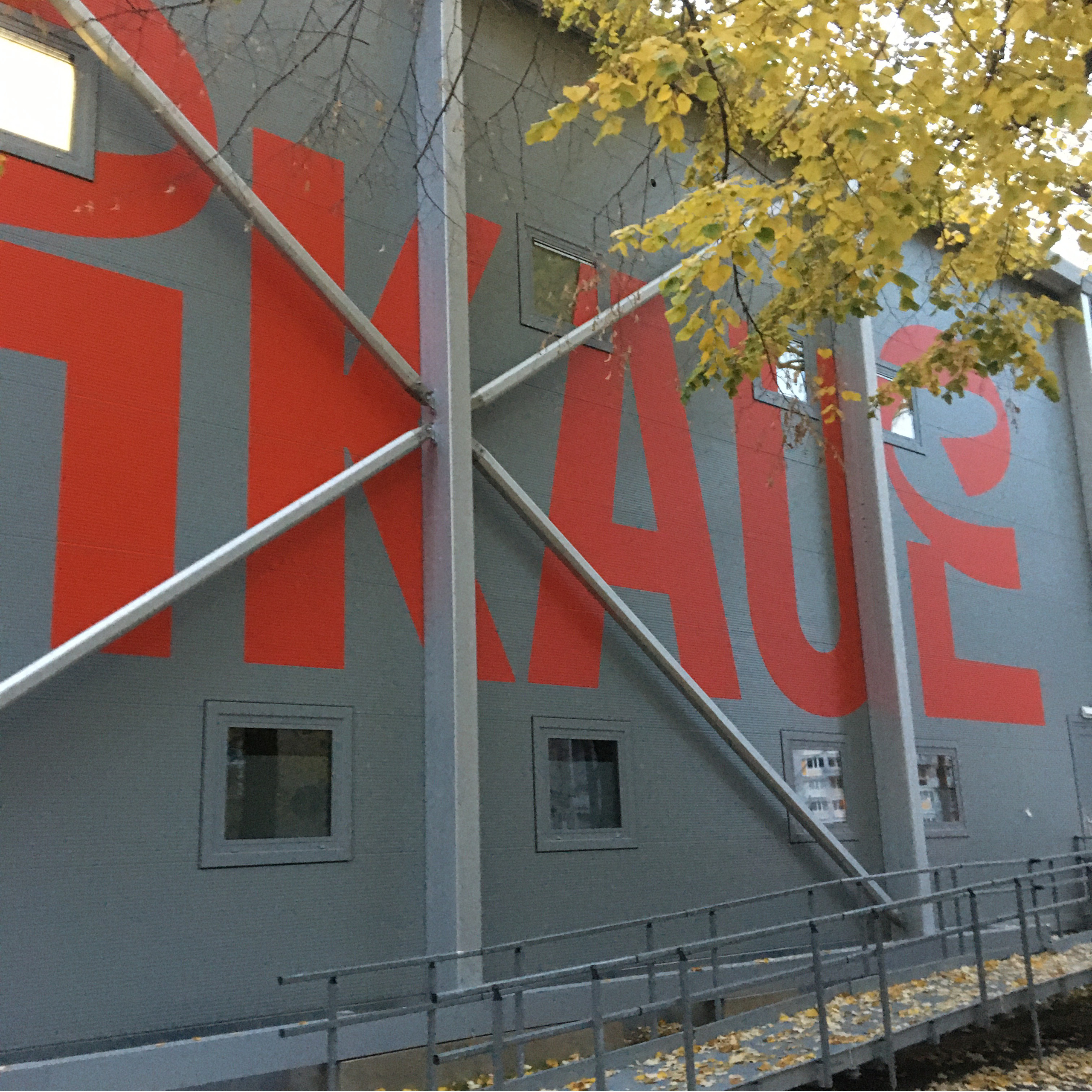
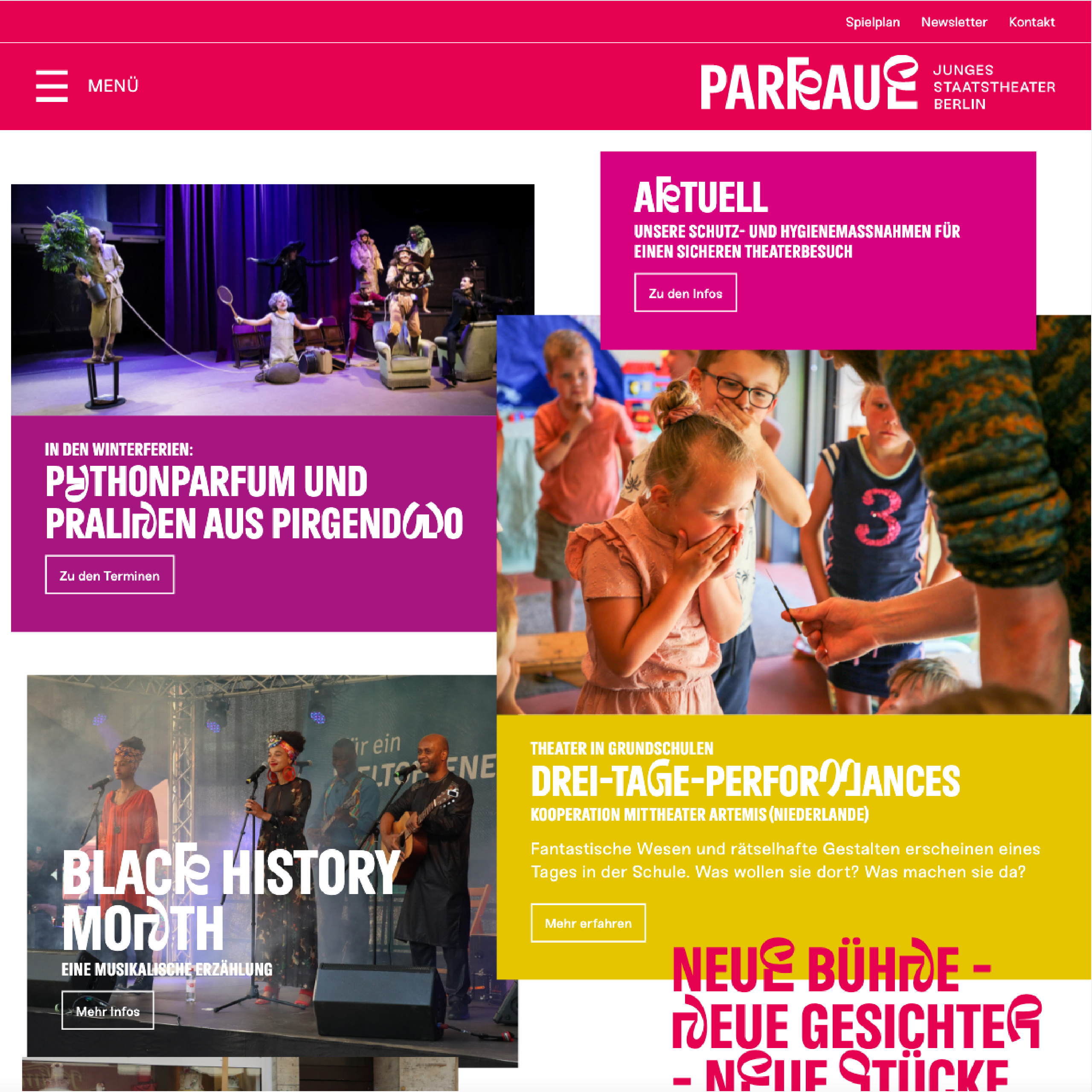
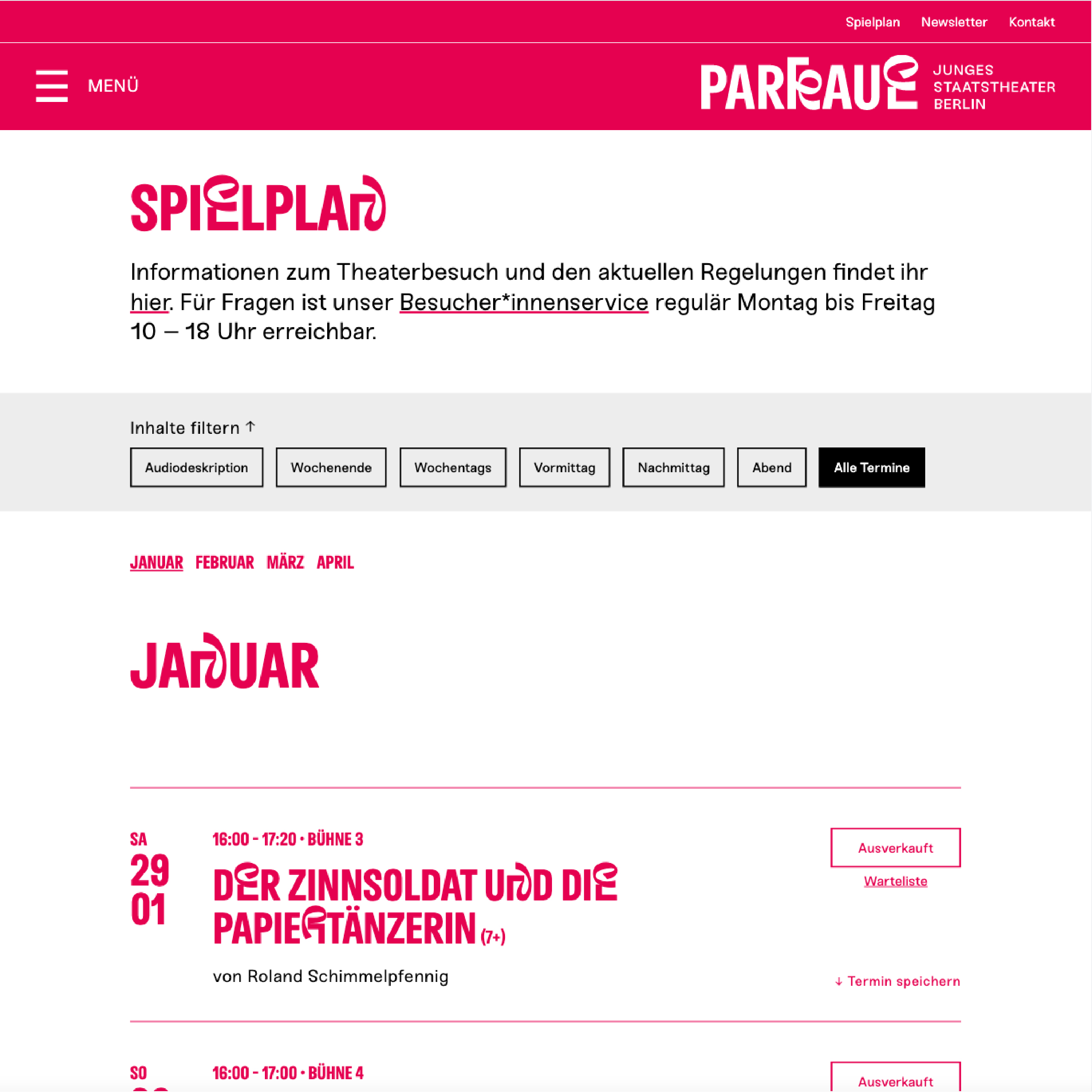
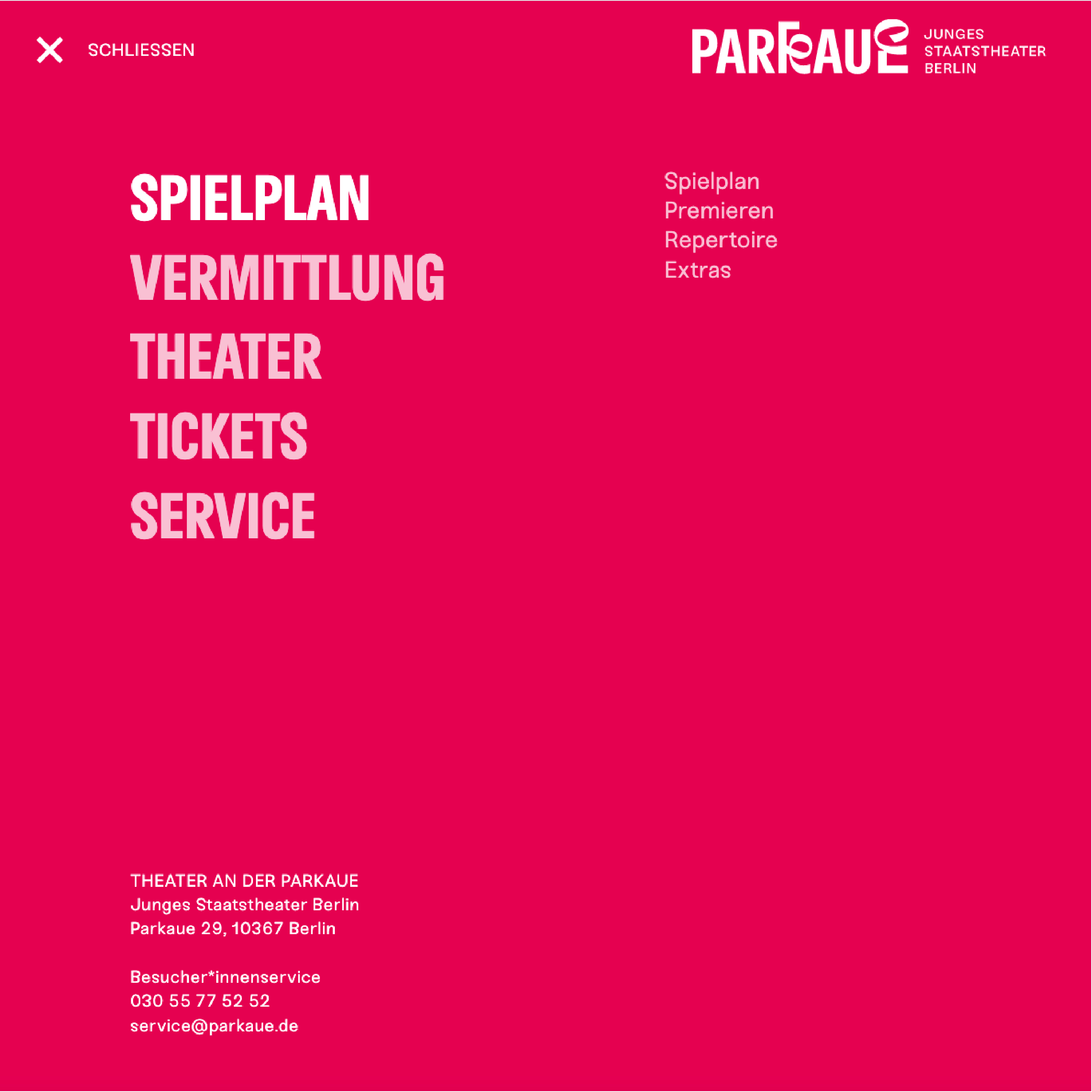
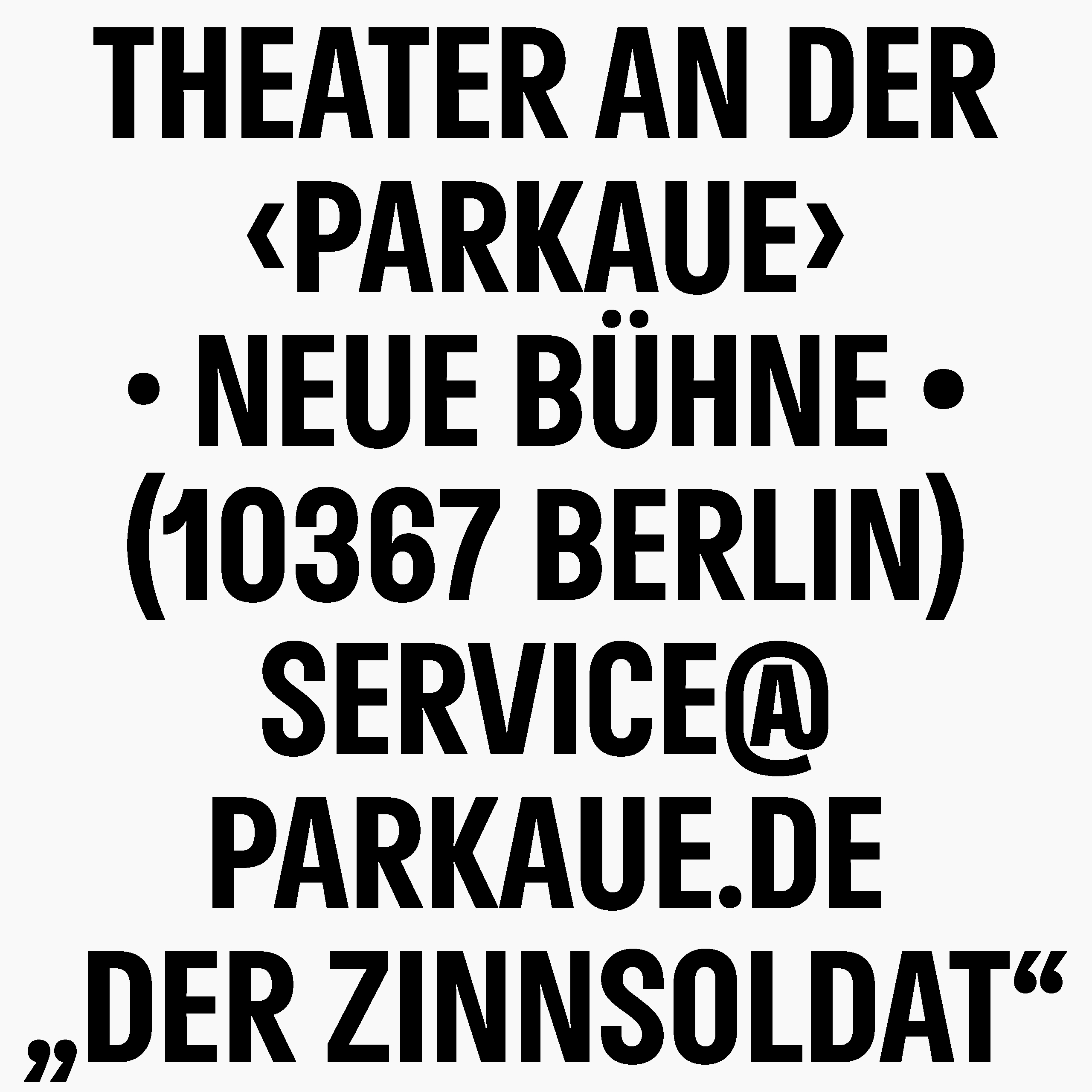
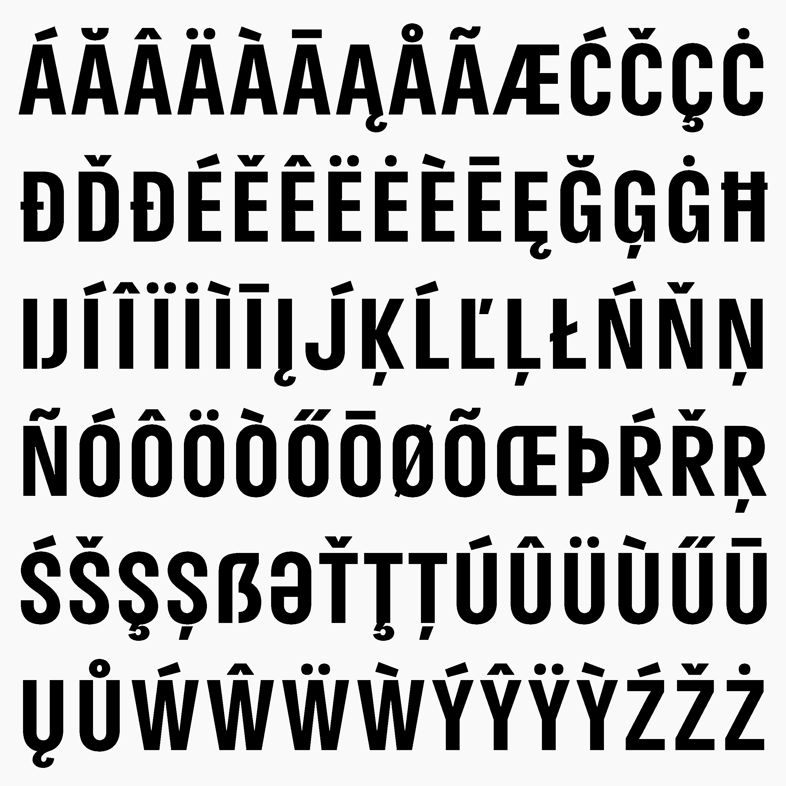
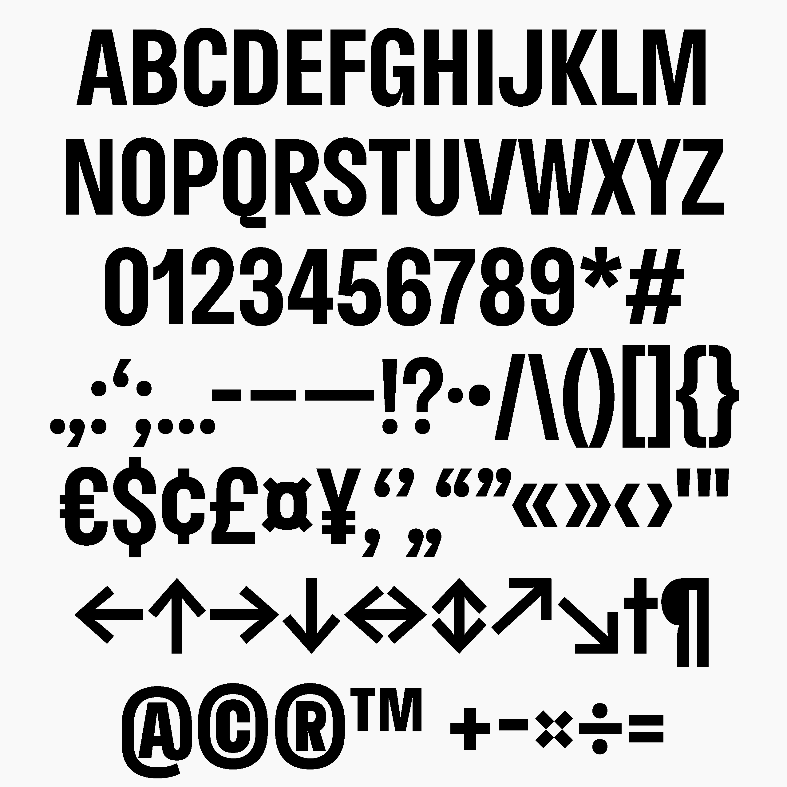
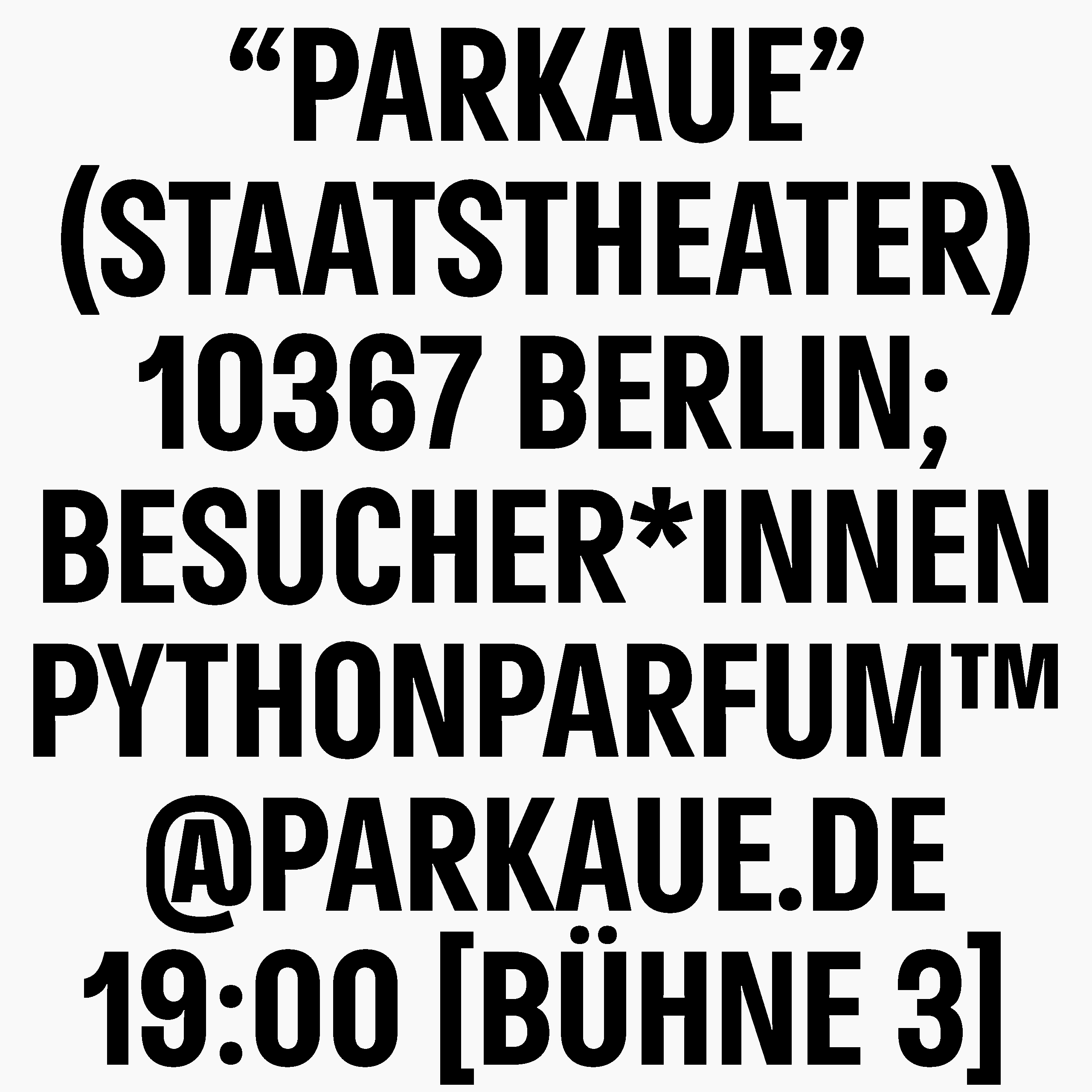
Theater an der Parkaue
〔EN〕 For the Junge Staatstheater Berlin, Theater an der Parkaue, a new corporate typeface, the “DS Parkaue”, was developed in 2021. The focus of the development was on the one hand the high legibility as a purely capital typeface, but also the dynamic integration of a second typeface that exchanges individual letters via an open-type feature. This creates a dynamic dialogue between the two typefaces, which become an ensemble based on the performances in the theatre. The typeface is developed in 35 languages, has over 340 glyphs and 10 layout features.
〔DE〕 Für das Junge Staatstheater Berlin, Theater an der Parkaue wurde 2021 eine eigene Hausschrift die „DS Parkaue“ entwickelt. Im Vordergrund der Ausarbeitung stand zum einen die hohe Lesbarkeit als reine Versalschrift aber auch die dynamische Integration einer zweiten Schrift, die einzelne Buchstaben über ein Open-Type-Feature auswechselt. Dabei entsteht ein dynamischer Dialog beider Schriftarten die, angelehnt den Aufführungen im Theater, zu einem Ensemble werden. Die Schrift ist in 35 Sprachen ausgebaut, besitzt über 340 Glyphen und hat 10 Layoutfeatures.
Corporate Identity: Ta-Trung
Font pair with Langulaire by Loris Pernoux
parkaue.de/
Custom typeface:

Typeface in use: